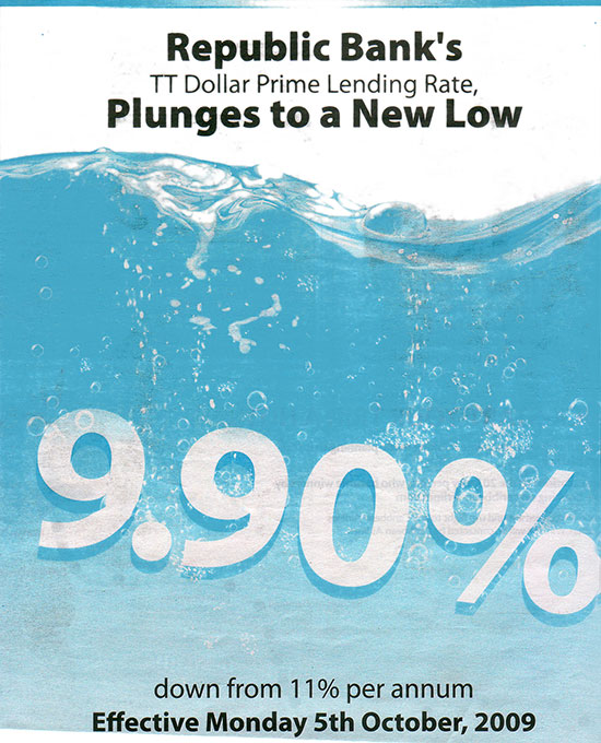
It’s scanning day! I vote this ad in for Best Use of Spot Colour! Collect your prize at the door.
Simple and effective, illustrates the ‘lowness’ of the interest rate using a sinking effect.
Ironically, I’ve used a similar water effect on the upcoming Blue Waters Website.


7 October, 2009, 1:13 pm
nice! What ‘wins’ in this for me is that this IS a local ad and they didn’t try to compensate for ittle copy by doing this really crazy visual, or using this nice visual and then killing it ith an overexplanatory copy. Great pick
7 October, 2009, 9:13 am
nice! What ‘wins’ in this for me is that this IS a local ad and they didn’t try to compensate for ittle copy by doing this really crazy visual, or using this nice visual and then killing it ith an overexplanatory copy. Great pick
7 October, 2009, 3:52 pm
like. totally. looked more interesting in print, of course.
8 October, 2009, 8:14 pm