Of course, I saw the full page version of this ad every DAY, but when I want to scan it I can’t find it.
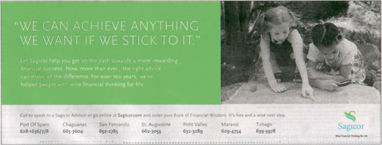
I love this series. Inspirational & eye catching, a simple two colour deal. The full page version features VERY generous use of space. A client once wanted me to get rid of the ‘deadspace.’ The correct name for this is whitespace and it’s very much alive. As designers, we pay close attention to what isn’t there.
Seehowspacebecomesimportant?
My only quibble with these ads are that they aren’t local. I want to see that this is Memorial Park, or Cleaver Woods or the Aboutique arcade on Frederick Street.


7 October, 2009, 1:18 pm
Hmmm.. even though I get it, I think the images could’ve been more fun, especially since they’re using kids. Like kids playing in the rain is the innocent fun way to use Nature’s waterworks, something that adults totally forget to do or don’t do because they worry about getting sick etc. The use of space definitely gives the ad a clean and modern look, so points for that.
7 October, 2009, 9:18 am
Hmmm.. even though I get it, I think the images could’ve been more fun, especially since they’re using kids. Like kids playing in the rain is the innocent fun way to use Nature’s waterworks, something that adults totally forget to do or don’t do because they worry about getting sick etc. The use of space definitely gives the ad a clean and modern look, so points for that.
7 October, 2009, 3:54 pm
so i’ve found a larger version of the ad. i’ll update the post accordingly. the use of whitespace is a bit more dramatic in a larger version. i don’t mind the ‘boringness’ of the image. i think it makes it more profound in a way
8 October, 2009, 8:16 pm