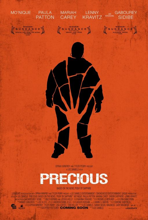
I felt compelled to draw attention to this example of print design. Trinis are rarely faced with poster design. Ad campaigns are centered around newspaper ads and billboards. We are almost never confronted with the physicality of a 4 foot tall poster. However, if you’re into the indie movie circuit or you’re an ardent Oprah or Tyler Perry fan, you’ve probably heard about this movie and seen this poster. Precious, Based on the Novel Push by Sapphire is the story of a verbally and sexually abused, obese, Black teenager. 16 year old Precious is illiterate and has two children by her father. But being the astute observer that you are, you’ve probably gathered all this from the disturbing poster itself. At a glance, what do we see? We’ve got:
- A large figure, wearing hoop earrings – in all likelihood, an overweight woman.
- The large figure is shattered into pieces.
- The figure’s pelvis is obliterated by a hand.
- The hand seems to have broken the figure.
- The hand is simultaenously reaching up for help, as a drowning person might.
- The fingertips of the hand radiate out – into long claws (or a sunburst effect, depending on your disposition).
All the components of Precious’ sad story are conveyed using two colours and simple shapes. Very Strong. Very very strong. Let’s say this type of design style follows a formula, if it did, the formula would be –
dC = Au
where d is design, C are Constraints or limitations and Au is Gold, gold as in sheer genius. Read more about the Poster:


20 November, 2009, 6:07 pm
dC = Au . Great way of summing it up, definitely a picture that says a thousand words with out the entire cast’s mugshots and a scenic background.
20 November, 2009, 2:07 pm
dC = Au . Great way of summing it up, definitely a picture that says a thousand words with out the entire cast’s mugshots and a scenic background.