Since this is scanning week, I’ve used my secret time machine to bring you the Top Ten Eid Ads of 2009.
Ads are judged on design & layout, copy and brand-iness. As I’m a designer, the design will be weighted more heavily than otherwise. Pepper ads are excluded from competing.
10th Place:

Yeah sure, they’re trying to kill us, make our lives better by providing jobs. I liked this ad for its simplicity, for its use of brand colours and the use of real calligraphy you’d find in the Holy Qu’ran.
[clear]
9th Place:

Points for originality. Points for using an illustration, especially not a prettified cutsey illustration. The copy mentions community, and I do think the illustration supports it.
[clear]
8th Place:

Republic OWNS cyan, see my previous blog post, best use of spot colour. Points for fidelity to brand. The image, while not arresting, is authentic. The copy mentions ‘celebration,’ whereas I get more of a ‘meditation’ or ‘reflection’ feeling.
[clear]
7th Place:

Honestly I thought this was a radio station. Only in scanning it did I realise its a fireworks company! …A fireworks company…? Now I get it – the fireworks are outside! I think they did a good job of being respectful and sober while blending the excitement of fireworks. Fireworks!
[clear]
6th Place:

Great idea. Again, I admire a graphic saying two things at the same time. The execution is a leeetle clunky. But the copy ‘Peel away the layers’ is almost inspired.
[clear]
5th Place:

I really have to hand it to FCB. They actually contacted a customer, organised a photo shoot for him and his family of four, had them dress up, then drove to St Joseph and took a picture of the mosque there. A standing ovation. Authentic, authentic, authentic. Plus they used a page layout they always use.
Maybe this should have been no 1?
[clear]
4th Place:

I will admit I don’t know who these people are. I don’t know what they do. Very cursory research revealed almost nothing (minus points). Anyway, hopefully they invest in growing crops otherwise this ad would be a fail.
But I do like the sense of hope and growth this conveys. The rays falling from the moon onto the seedling… like God herself is blessing the earth. Coupled with a super simple greeting – ‘May the blessings of Allah be with you today and always.’
[clear]
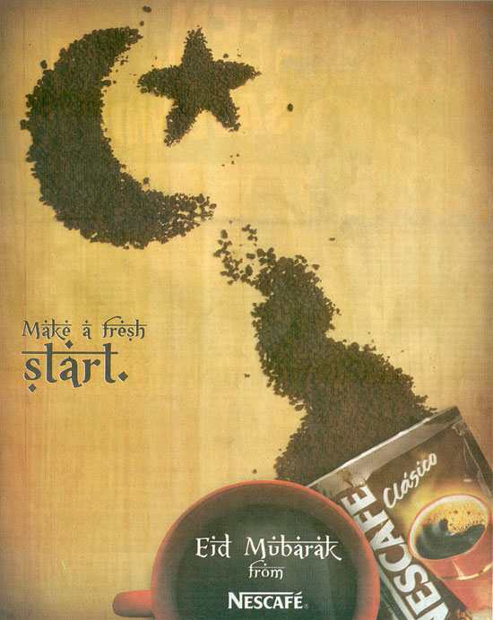
3rd Place:

Lovely. The execution of this is really strong. The copy really works – ‘Fresh Start’ – you can hardly get more brand-y. It was a toss up between this and the preceding EMBD ad for 3rd place. This won out because I heard Nescafe uses a similar effect in a tv ad. There’s nothing like consistency.
[clear]
2nd Place:

Obviously, I’m biased towards Sagicor ads. I love their colours, I love their logo. I like how understated they are. This is no different. Here we have an image of an adorable boy. But he’s not busy being adorable, no big eyes wide with wonder, no goofy grin he’s not even busy being pious. He’s just being a boy, playing with his fingers.
So as not to distract us – we have a grayscale image and brand colours. And as we can see, in a previous post, Sagicor uses this technique consistently. Bravo!
[clear]
And in First Place:

Absolutely stunning. I’m not even quite sure what it is. Something telecommunications-related, fibre optics? Pins? The light effects (really big in graphics now) are really interesting and abstract.
I’m not thrilled about the ‘Eid Mubarak’ type and colour. But based on looks alone this is a winner. I remember actually gasping when I turned the page.


8 October, 2009, 6:37 am
Great picks! I definitely would've put both Maggi and the Nescafe ads in the top 3, why? They're the only ads that literally use their product to symbolise the spirituality of this festival, while everyone else hints or makes metaphors to it. I didn't see the Blink ad, but it's definitely interesting. All in all I think the ads for Eid were really good..I can't wait for Divali and Christmas!
8 October, 2009, 1:37 pm
Great picks! I definitely would’ve put both Maggi and the Nescafe ads in the top 3, why? They’re the only ads that literally use their product to symbolise the spirituality of this festival, while everyone else hints or makes metaphors to it. I didn’t see the Blink ad, but it’s definitely interesting. All in all I think the ads for Eid were really good..I can’t wait for Divali and Christmas!
8 October, 2009, 5:09 pm
using you actual product is very clever, yes. but what if you sell insurance? or you're a bank? your product is a service not a good. besides, it would start to get played out
9 October, 2009, 12:09 am
using you actual product is very clever, yes. but what if you sell insurance? or you’re a bank? your product is a service not a good. besides, it would start to get played out
9 October, 2009, 7:12 pm
True, great top 10 selection! Greeting ads that impress me are usually authentic, conveying a sincere greeting rather than just corporate or product/service branding.
10 October, 2009, 2:12 am
True, great top 10 selection! Greeting ads that impress me are usually authentic, conveying a sincere greeting rather than just corporate or product/service branding.
20 October, 2009, 8:30 am
Gotta agree with you on the number one pic…not sure why one of the bottled water companies didnt think of this.. real nice choice of colours
20 October, 2009, 3:30 pm
Gotta agree with you on the number one pic…not sure why one of the bottled water companies didnt think of this.. real nice choice of colours
23 October, 2009, 2:18 pm
Thanks for taking the time to do this kind of review. Ultimately it serves an important purpose for your industry. For the rest of us – its pretty enlightening.
Good stuff!
23 October, 2009, 9:18 pm
Thanks for taking the time to do this kind of review. Ultimately it serves an important purpose for your industry. For the rest of us – its pretty enlightening.
Good stuff!
23 October, 2009, 9:18 pm
Thanks for taking the time to do this kind of review. Ultimately it serves an important purpose for your industry. For the rest of us – its pretty enlightening.
Good stuff!